This is a specialist style, not a generalist one
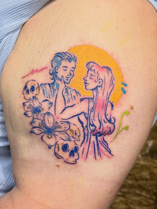
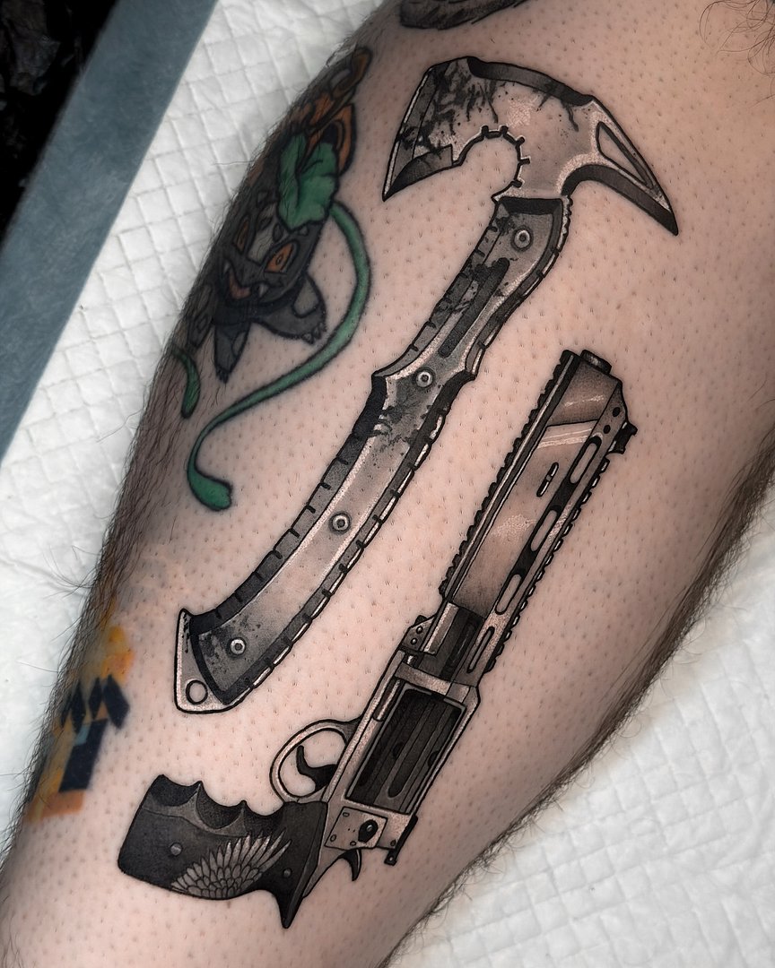
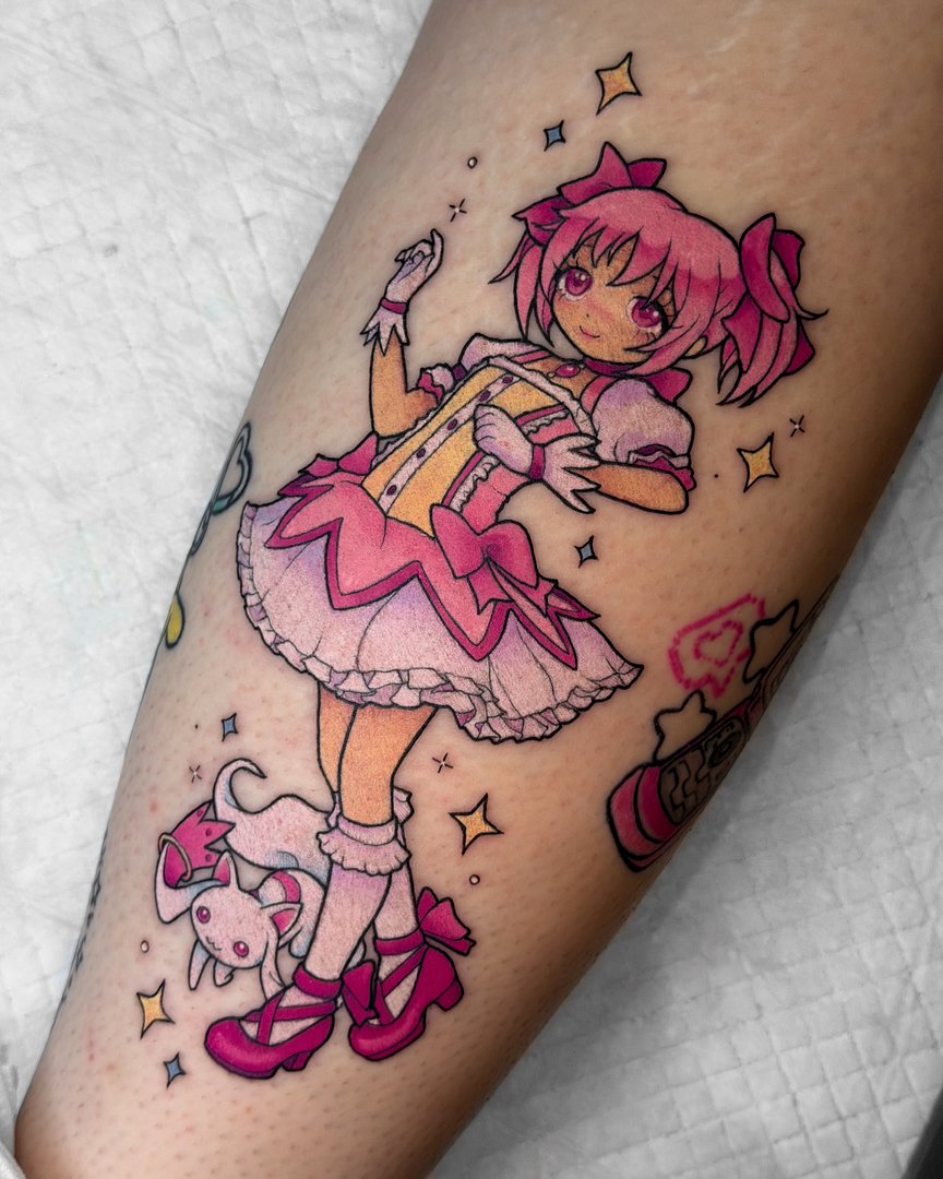
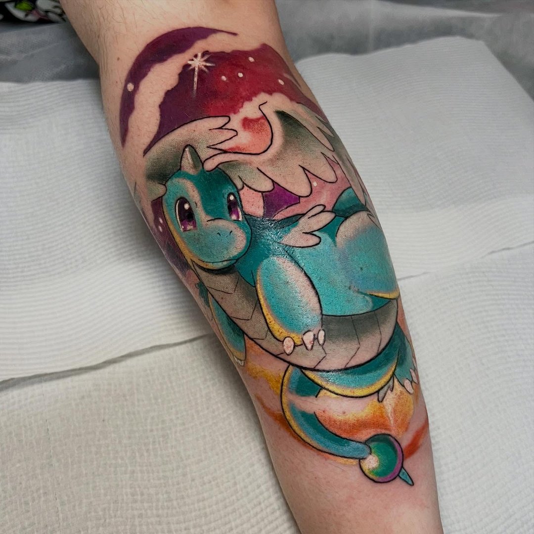
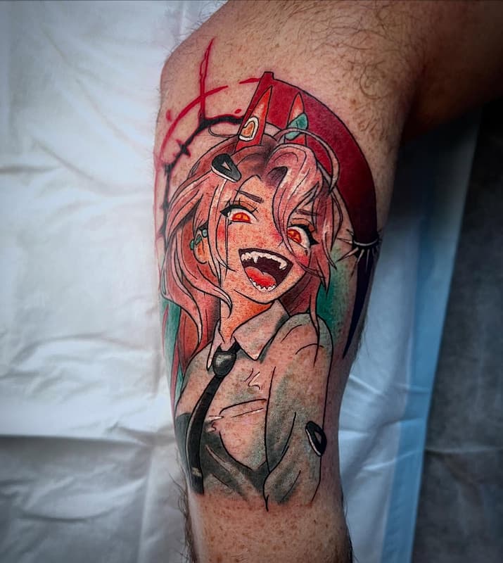
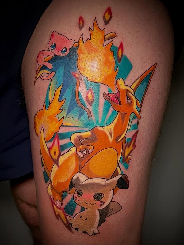
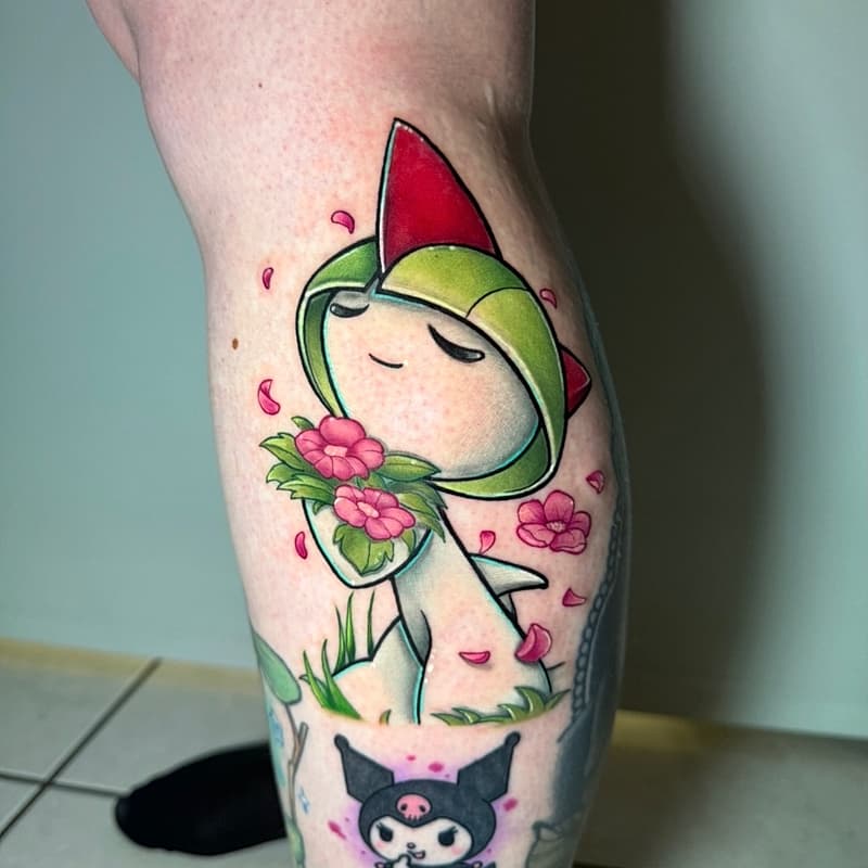
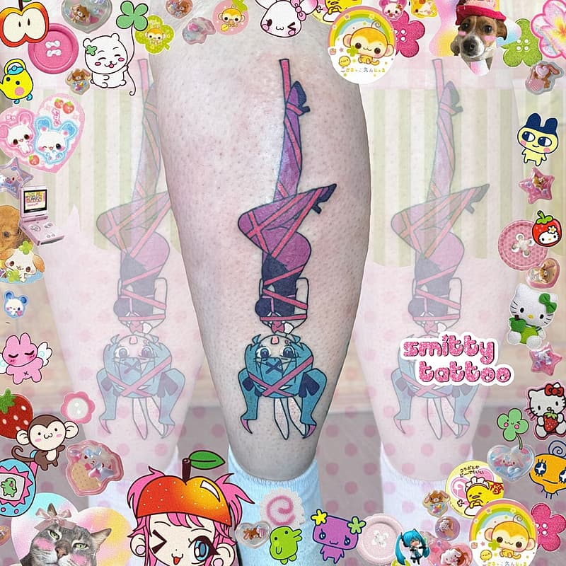
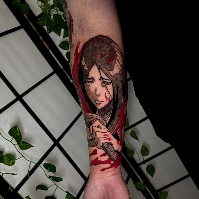
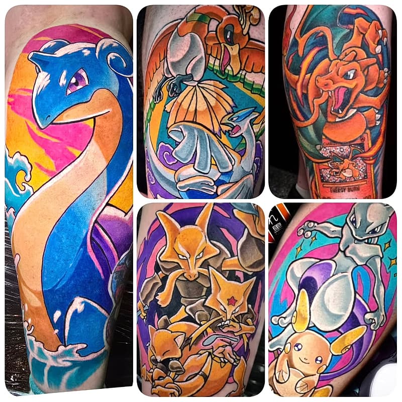
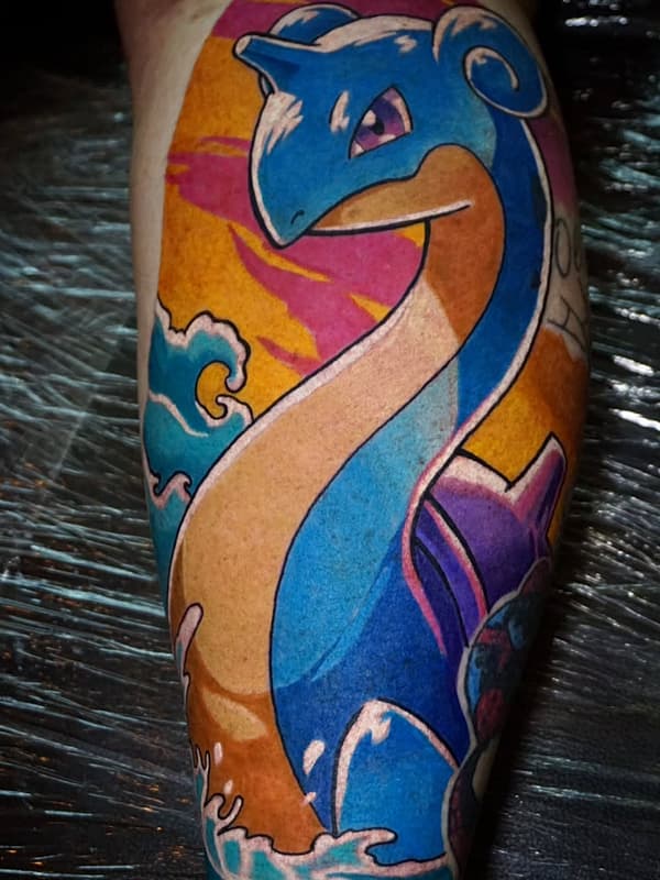
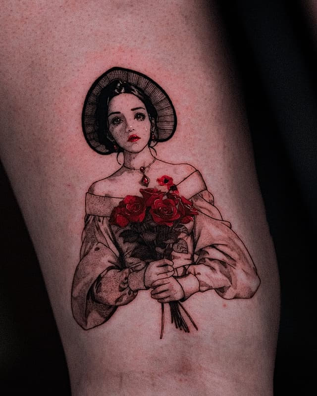
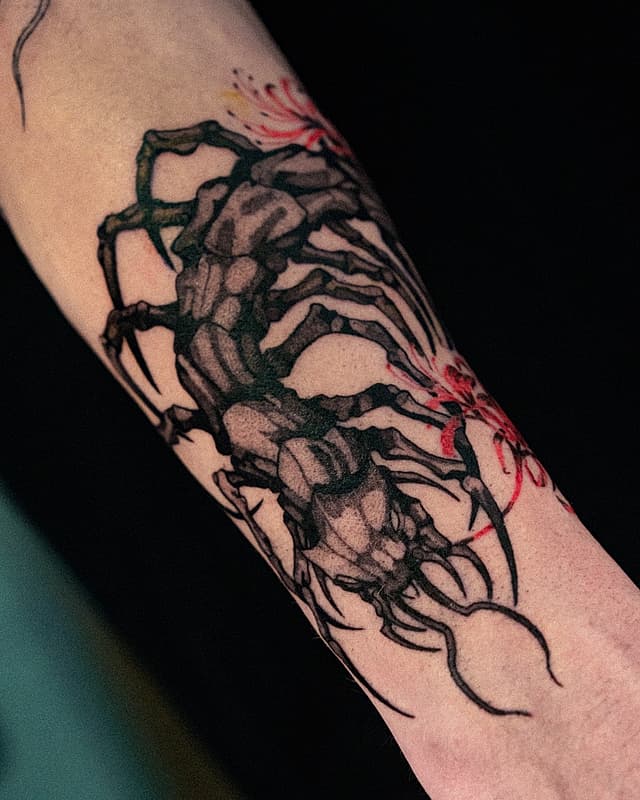
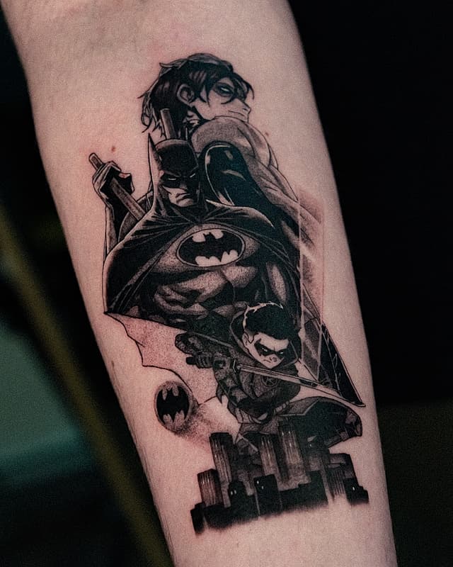
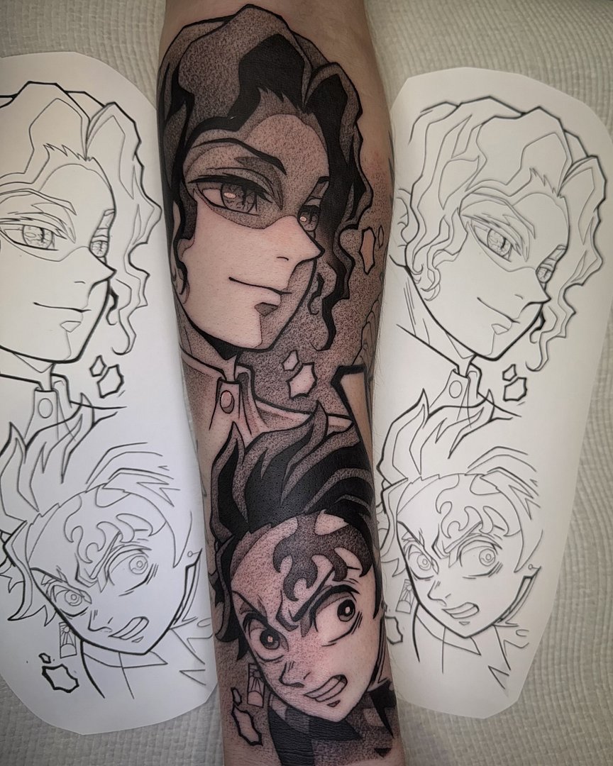
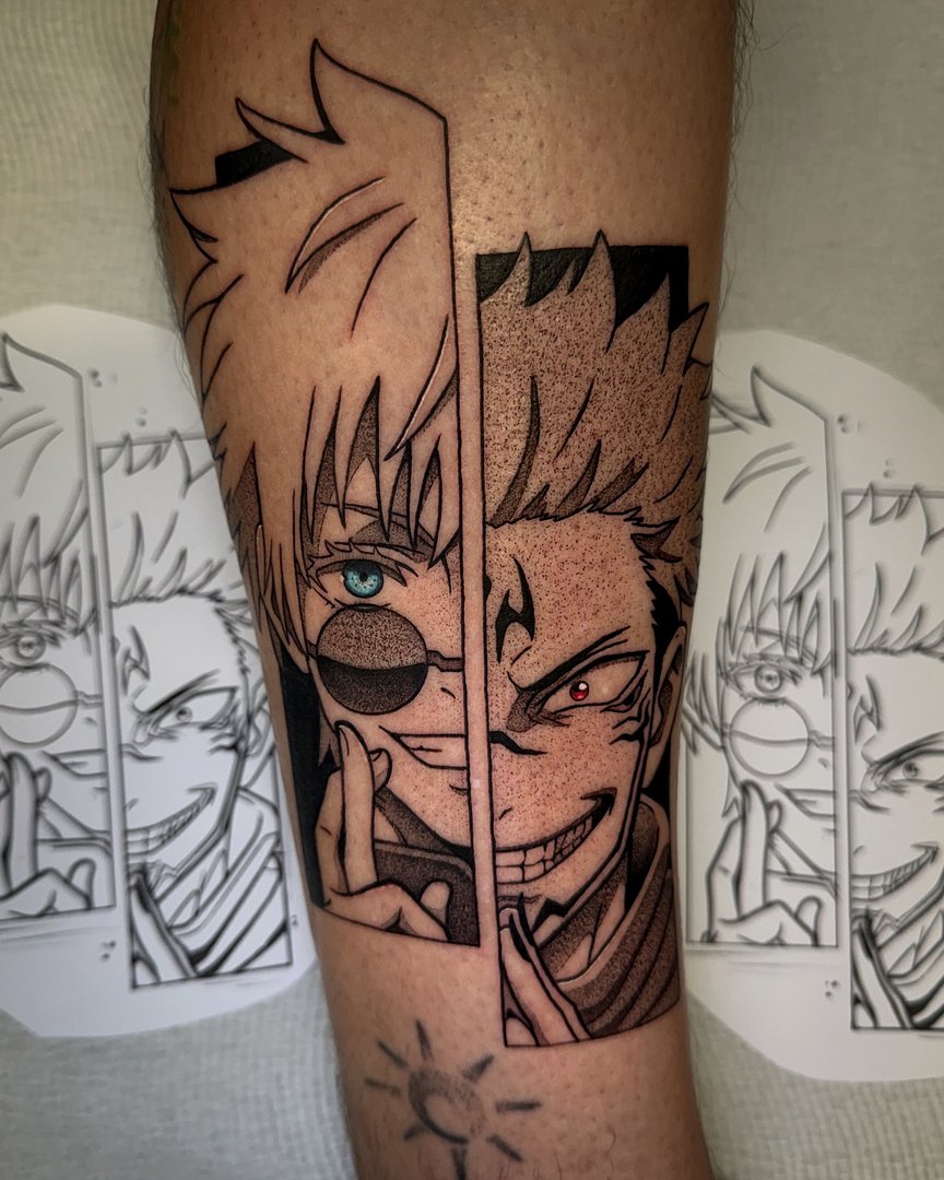
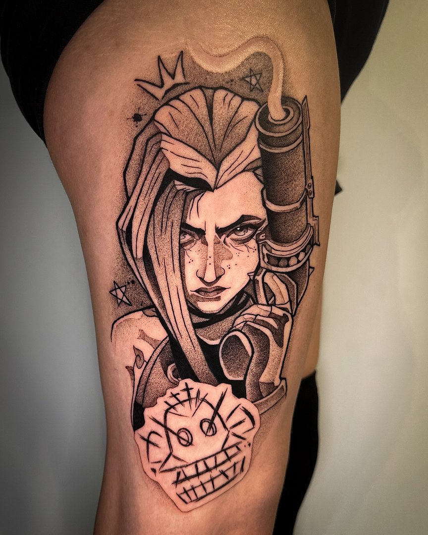
Anime tattooing is built on things most tattooers never practise: razor-consistent linework, cel-shading, and colour packed saturated enough to read like a frame of animation. A brilliant all-rounder can still botch an anime piece, and most of the 'tattoo fails' content you've seen is exactly that: a generalist taking on a style they don't do. The fix is boring and reliable: only book artists whose portfolios are full of anime work, not one lucky piece.
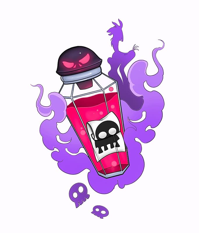
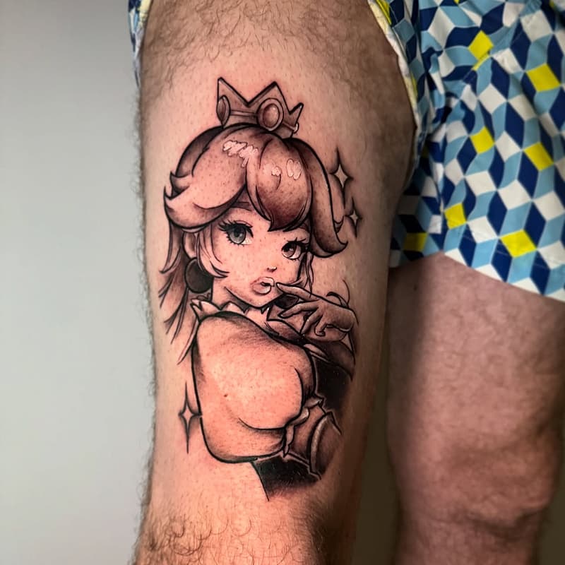
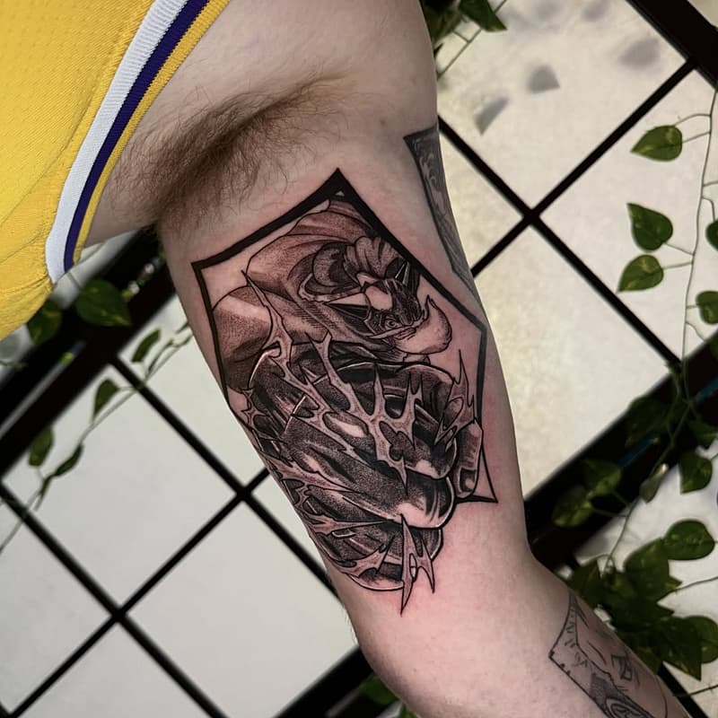
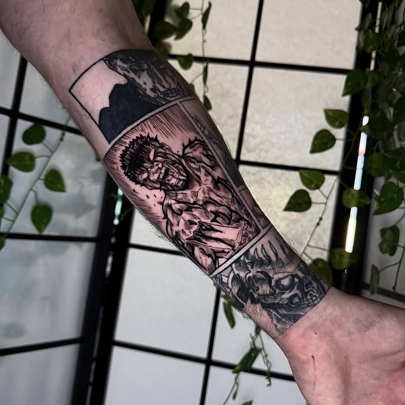
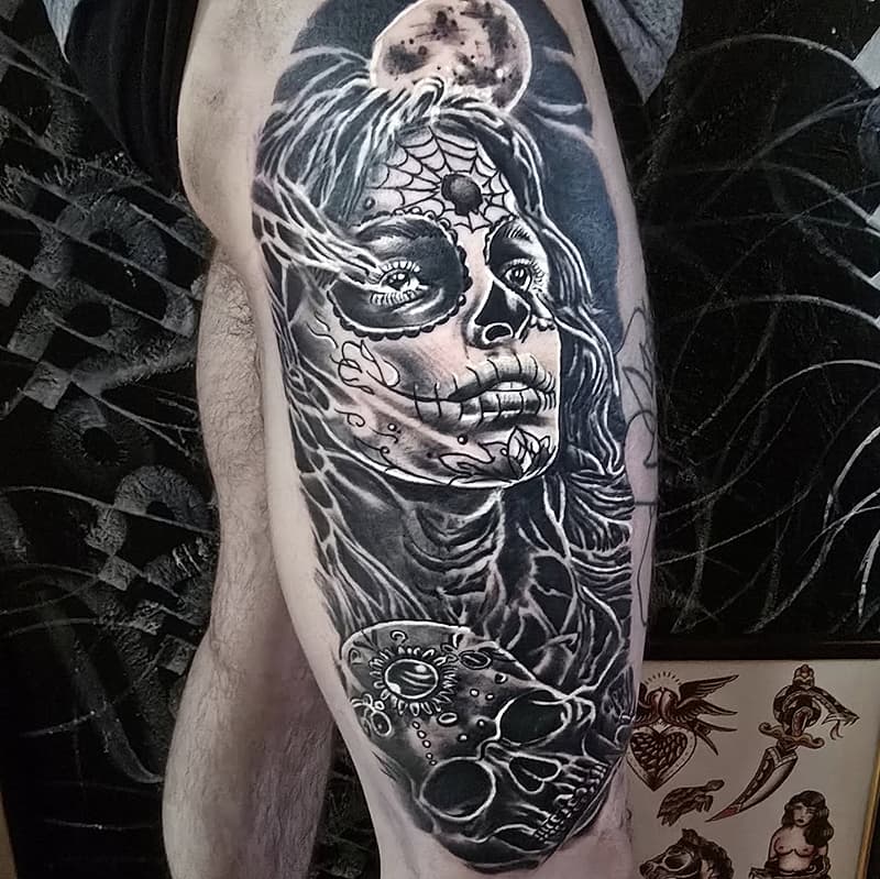
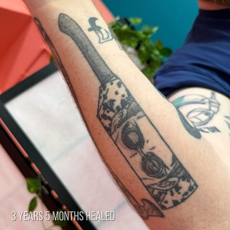
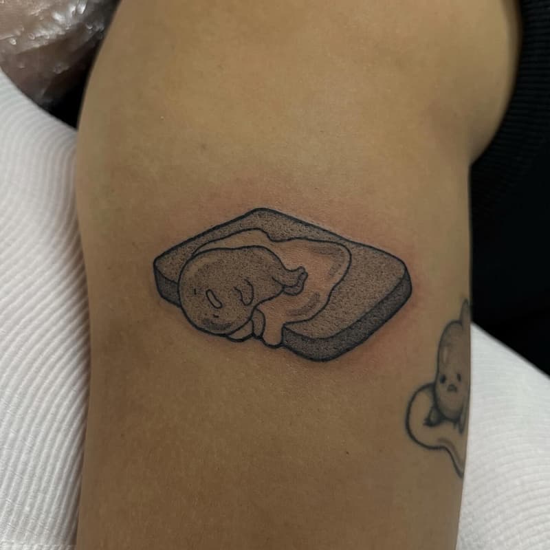
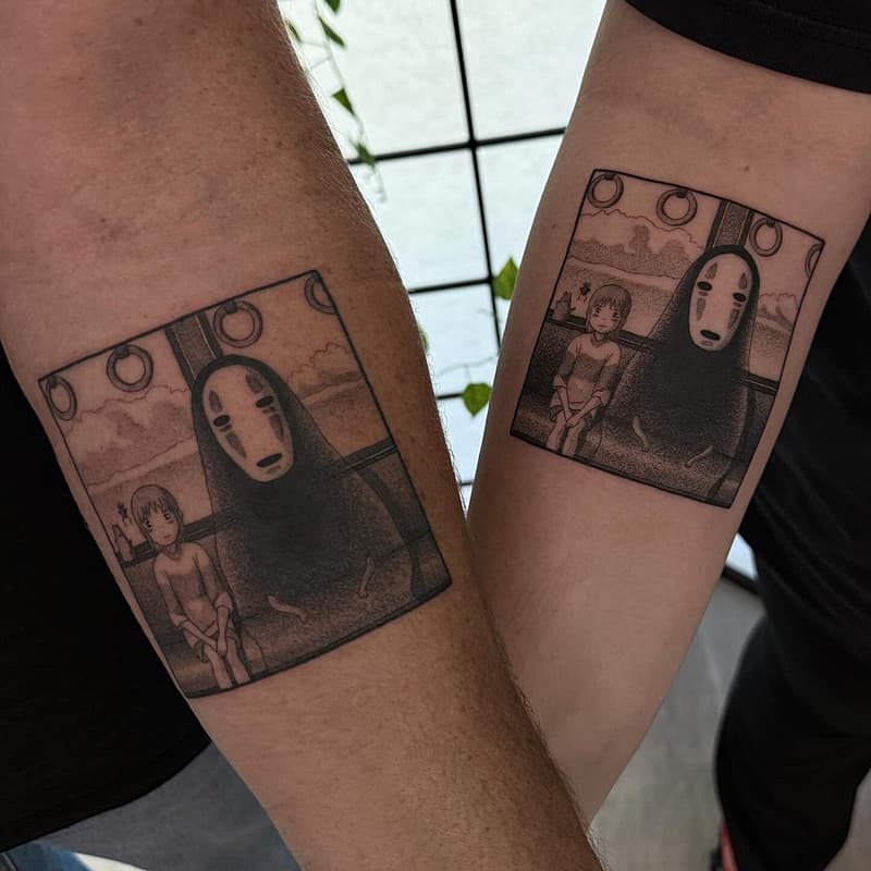
It also helps to know which sub-style you're actually asking for, because they're different skill sets. Cel-shaded colour characters, black and grey manga panels with their screentone-style shading, and American 'new school' cartoon work with its exaggerated proportions are three different crafts. Look through your saved references and work out which one keeps showing up, then find the artist who lives in that lane. Browsing artists by style on REAP's discover pages is the fast way to see who near you actually specialises.