The rule that decides everything: readability over time
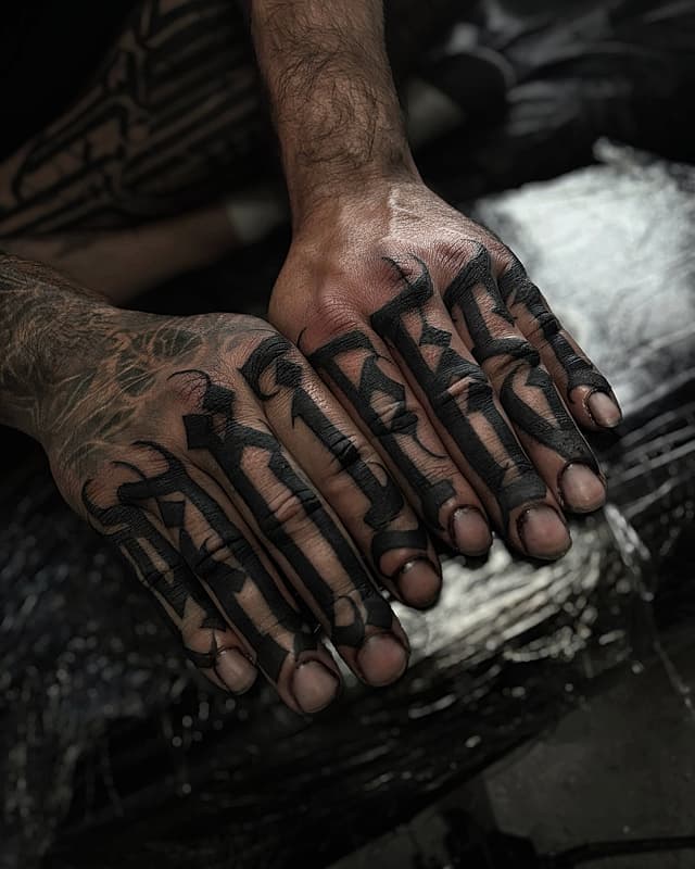
Every question about lettering tattoos comes back to one fact: ink spreads slightly under the skin as years pass. In a rose that's invisible. In a word, it's the difference between a quote and a smudge. Small letters with tight loops, the e, a and o of cramped cursive, close up first, and a phrase that looked delicate fresh can read like a barcode in five years.
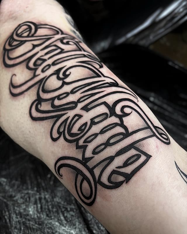
The fixes are size and spacing. Keep letters at roughly 1 to 1.5 centimetres minimum height, give them room to breathe, and be suspicious of any design you can't read from across the room while it's still on paper. A good lettering artist will push back on tiny text; that push-back is the expertise you're paying for. Cursive versus block matters less than people think: cramped cursive is the worst-aging option, but well-spaced script and clean block letters both go the distance.
Where words last, and where they don't
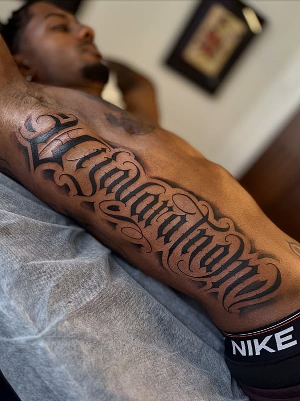
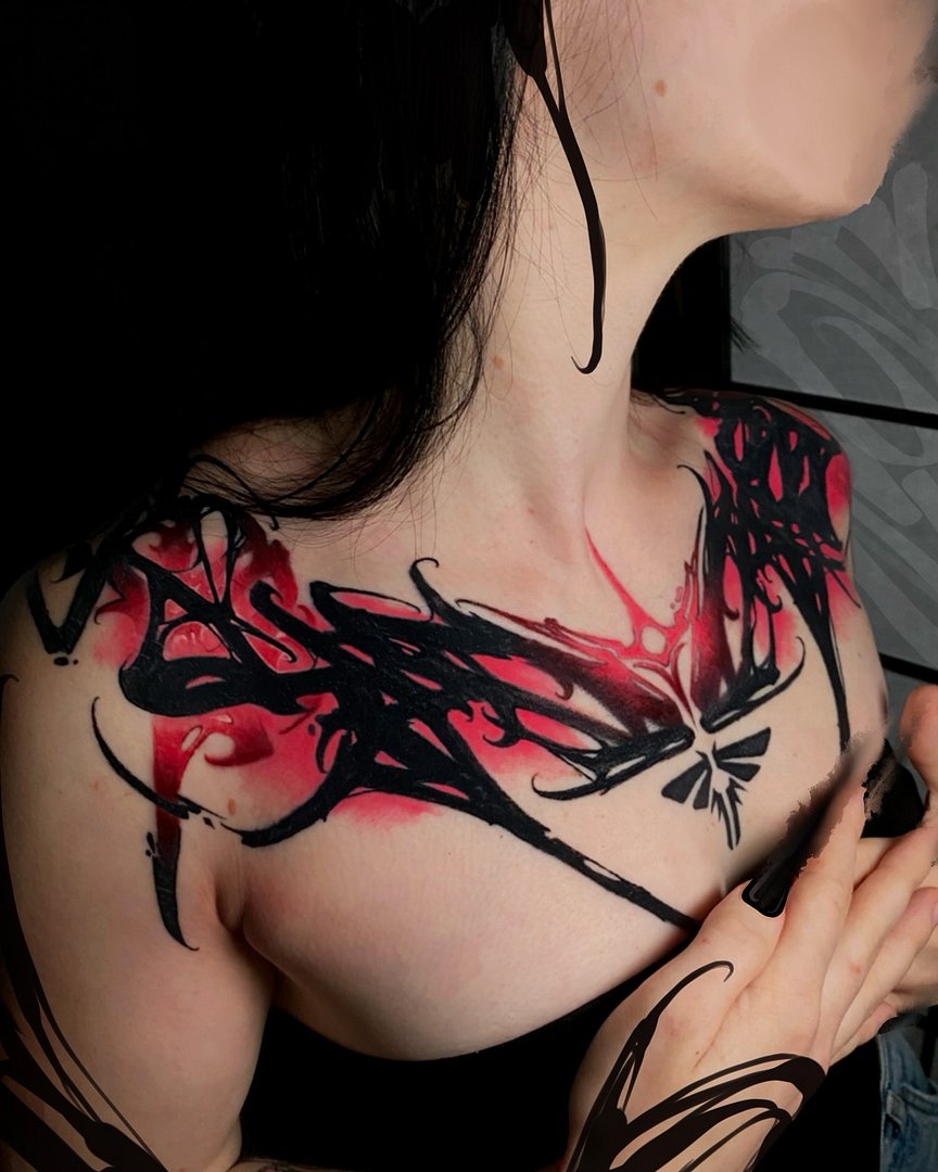
The forearm is the default for a reason: flat, stable, low-friction skin that you can actually read yourself. Ribs, the collarbone and the spine suit longer quotes and are popular; know that all three hurt more and cost more, since curved, bony areas are slower to work on.